Auto Layout
Auto Layout is a smart layout system that manages the positioning, sizing, and spacing of widgets for you. Inspired by CSS Flexbox, it allows you to build responsive interfaces by simply configuring direction, alignment and spacing in Studio, rather than writing complex CSS or managing deep hierarchies. At its core, Auto Layout groups sibling widgets into a Container widget that arranges them along a horizontal or vertical axis. This approach leads to:
- Flatter structures with fewer nested elements leading to cleaner widget trees.
- Built-in responsiveness, reducing manual layout adjustments.
A Content-First Approach
Auto Layout enables a content-first way of building layouts. Instead of starting with empty structural containers, you can begin with your actual content, the widgets themselves. To structure them in a layout, simply select the sibling widgets you want to group and add Auto Layout to them. They will be wrapped in a Container that will act as the parent frame for the layout and manage direction, alignment and spacing for the children. Creating the necessary layout structure around your content instantly.
This approach makes it faster to design, develop, and maintain complex interfaces while keeping your structure intuitive and clutter-free.
Using Auto Layout
Content First
To apply Auto Layout using the content-first approach, start by selecting multiple sibling widgets on the canvas (hold Shift and click to multi-select). Once selected, you can either:
- Right-click the selection and choose Add Auto Layout from the context menu.
- Or, with the selection active, click Add Auto Layout in the Properties panel.
This wraps your selected widgets into a new Container widget. You can manage the layout using the properties available in the layout section of Properties panel of the newly created Container widget.
Container First
Alternatively, if you have an existing Container widget, you can drag widgets into it. The container will automatically arrange the child widgets based on the configured properties.
Auto Layout Properties
To configure the layout of a Container widget, several properties are available in the layout section of its Properties panel.
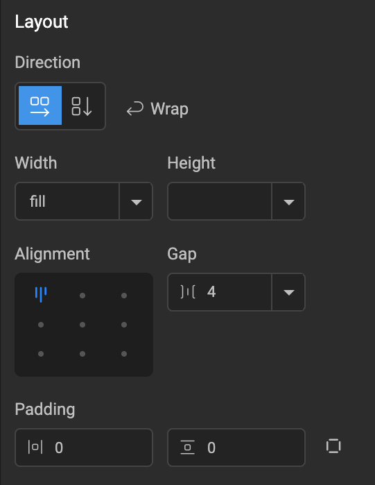
Direction
The Direction property sets the main axis along which child widgets flow.
- Row: Children arrange horizontally.
- Column: Children stack vertically.
Wrap
The Wrap property is available when direction is set to Row. It controls whether child widgets should flow onto a new line when they exceed the available space along the row.
- Wrap Enabled: If child widgets exceed the available width in a row, they will automatically move to the next line.
- Wrap Disabled (Default): Child widgets will remain on a single line. If their combined width exceeds the available space, they will attempt to squeeze to fit, and if it can't be squeezed enough to fit then it overflows the container.
When Wrap is enabled, an additional spacing control (Row Gap) is available to adjust the spacing between lines.
Height & Width
Height and Width control how the Container computes its size relative to its parent or children.
- Fill: Expands to fill all available space in the parent Container.
- Hug: Shrinks or grows to exactly fit the combined size of children (plus any spacing like Gap, Padding).
- Fixed: Sets a fixed size. Accepts numbers (defaults to
px) or numbers with units (px,%,vw,vh).
Alignment
Alignment determines how child widgets are positioned within the available space of the parent container, both along the main axis (defined by Direction) and the cross axis.
The available alignment options are based on the Gap and Row Gap values:
- Fixed Spacing: When both Gap and Row Gap are set to fixed numeric values, you have full control over alignment. This allows precise positioning using a 3x3 grid of options (e.g., Top-Left, Middle-Center, Bottom-Right etc).


- Gap is
Auto: If Gap is set toAuto, the available space along the main axis is automatically distributed evenly between child widgets. This removes explicit alignment control along the main axis, but cross-axis alignment (Start, Center, End) remains available.


Row Gap is
Auto: Similar to Gap, if Row Gap is set toAuto, the available space along the cross axis is automatically distributed evenly between rows. This removes explicit alignment control along the cross axis.Both Gap and Row Gap are
Auto: When both are set toAuto, all available space in both directions is automatically managed, and explicit alignment options are no longer available.
Gap
Gap defines the spacing between adjacent child widgets along the main axis.
- Number: Sets a fixed size in pixels.
- Auto: Automatically distributes available space evenly between all the child widgets.
Row Gap
Row Gap defines the spacing between rows when Wrap is enabled.
- Number: Sets a fixed value in pixels.
- Auto: Automatically distributes available space evenly between all the rows.
Padding
Padding adds space between the container's boundary and its children, similar to standard CSS padding. It accepts numerical values in pixels.
In the Studio, padding can be configured in two ways:
- Two fields (default): One for
Horizontaland one forVerticalpadding.- A single value (e.g.,
10) applies to both sides (e.g.,Left:10px,Right:10px). - Two comma-separated values (e.g.,
10,20) apply to each side respectively (e.g.,Left:10px,Right:20px).
- A single value (e.g.,
- Four fields: A toggle allows switching to separate
Top,Right,Bottom, andLeftinput fields for granular control.
Properties Reference
| Prop Name | Possible Values | Description | CSS Equivalent |
|---|---|---|---|
| Direction | "row", "column" | Defines the primary axis along which children are laid out. 'row' arranges children horizontally, 'column' arranges them vertically. | flex-direction |
| Wrap | Enabled, Disabled | When enabled, children will wrap to the next line or column if they exceed the container's available space along the main axis. | flex-wrap |
| Height & Width | "fill", "hug", number, number with unit | Determines how the container's height and width are calculated. 'fill' expands to fill available space, 'hug' shrinks to fit its content, or a fixed value. | Uses a combination of width, height, flex-basis, flex-grow, flex-shrink |
| Alignment | 'top-left', 'top-center', 'top-right', 'middle-left', 'middle-center', 'middle-right', 'bottom-left', 'bottom-center', 'bottom-right' | A shorthand property that combines justify-content (main axis alignment) and align-items (cross axis alignment) for common layout patterns. | justify-content, align-items |
| Gap | 'auto', number | Sets the spacing between child elements along the main axis. Can be a fixed pixel value or 'auto' to distribute available space evenly. | gap |
| Row Gap | 'auto', number | Specifies the spacing between rows when wrap is enabled. This property is not available if wrap is disabled. | row-gap |
| Padding | number, string (e.g., "10,20") | Adds internal spacing between the container's boundary and its content. | padding |